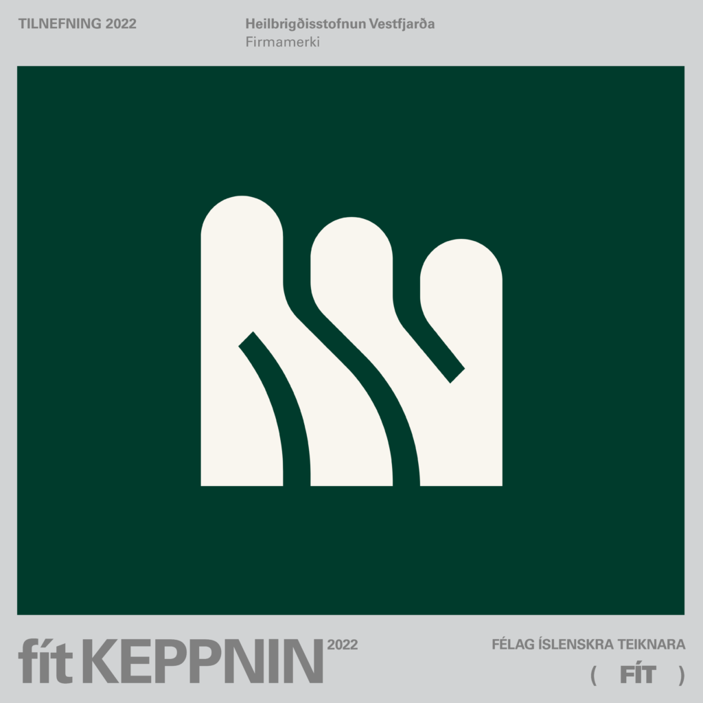
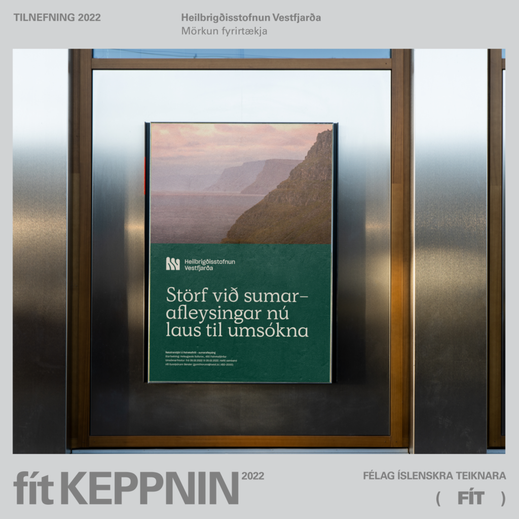
Sigurðar Oddsson's new look for the Vestfjörður Health Foundation was recently nominated in two categories of the FÍT awards; company logo and demarcation of companies. Award winners will be announced on April 1st.
Sigurd has previously received recognition for his work. For example, he won together with the sculptor Matthías Rúnar Sigurðsson and the 3D designer Gabríel Benedikt Bachmann Iceland Design Award 2021 for the project Hjaltalín – ∞. Then he won four awards in the 2021 FÍT awards and still others 2019 to name a few.


Fun and reassuring
"I appreciate the extremely good cooperation with Gylfa, Greip and everyone involved in the preparation and execution of the project. It often doesn't take very many people to do good things when everyone puts in the effort, and I thought this process was a very good example of that. To receive recognition from my colleagues in the profession is always fun and reassuring that we are on the right track," says Sigurður.
Council is beautiful
"It had long been clear that a unified look was needed for a unified organization. Having it all out and south didn't reflect a unified organization, it was a bad fit, and it was just plain expensive. Questions that need to be answered regularly arise; what sign to put up and how to label the clothes and how should the website look like and so on along the streets? Answering these questions separately is much more expensive and time consuming than doing it just once and doing it well. When this is done in one piece, it will also be so brilliantly beautiful and harmonious," says Gylfi Ólafsson.
"We worked hard and put a lot of time into the preparation. For example, we had a closed pre-selection where we managed to ensure efficiency in the involvement of a graphic designer. After that, a preparatory process began to decide what kind of organization we are and what goals we have with our work," says Gylfi.
"An in-house team was created to handle the preparations. Greipur Gíslason advised the executive board and the team during the process. We have gone rather slowly, partly to save money. We have by no means implemented this everywhere, but when we do something new or renew, we know what it should look like."