The Vestfjörður Health Institute was created in its current form in 2014 with the merger of the then Vestfjörður Health Institute and the Patreksfjörður Health Institute. Mergers had already taken place irregularly in the previous decades. At first there was little need or technical prerequisites to have a special logo for this type of activity, but in the second half of the twentieth century it began to gain ground.


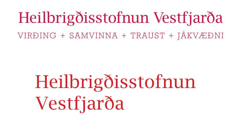
The logo that has been used in recent years is not a logo in itself, but the name of the organization written in a certain font in a certain red color. This was never intended to be a permanent solution to the agency's identity, although it became one.
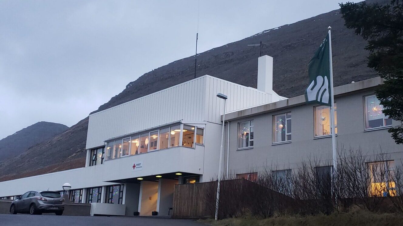
In modern society, this is actually quite impossible. This works poorly on computer screens, is tiny and unmemorable. More, unrelated to the logo, have been out of order: staff clothing, outdoor signs, indoor signage, the home page, staff placards and much more.
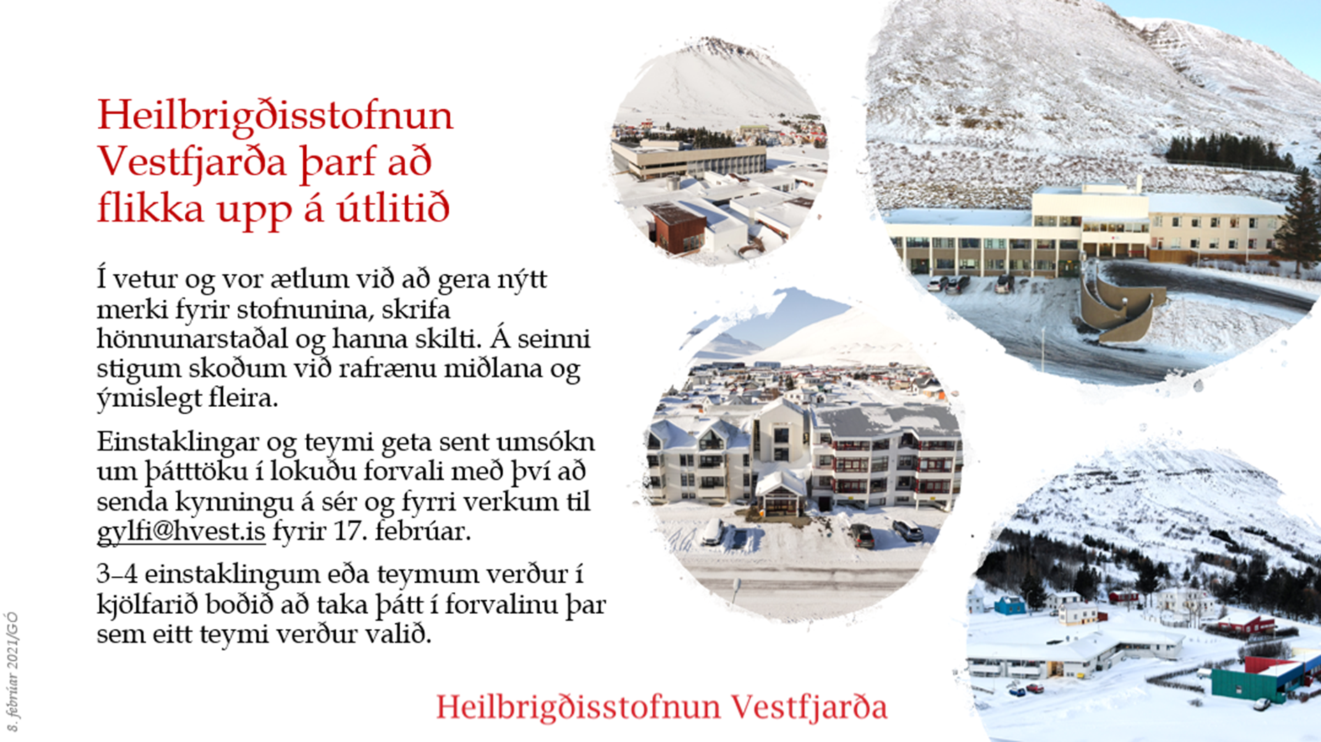
When making the budget for 2021, we set aside some money to start the first steps to address this.
Early this year we therefore advertised for graphic designers to participate in a pre-selection. Everyone who asked was allowed to participate, and the designer Sigurður Oddsson was chosen. He has long and successful experience with similar projects, for example for the National Museum of Iceland, and is recipient of the 2021 design award.
The strategic planning process was carried out and the result was a proposal based on placing personal service in the foreground with an emphasis on a warm, modern experience. Accessible and optimistic visuals are framed with simple
but a reassuring graphical system.
There are two distinctive colors, dark green and cream. The green is not only warm and earthy, but also refers to the clothing of the operating room staff. However, it is dark enough to stand in for black in text. Opposite comes a warm creamy color that represents warmth and human intimacy.

The symbol shows H, V, possibly S, representing care, human presence, community, peace and softness.
It comes in two main versions, green on cream and cream on green, although other versions also come.

The symbol shows H, V, possibly S, representing care, human presence, community, peace and softness.
The logo can be both small and large, making it suitable for computer systems.
We are also going to adapt under new keywords: Hello Westfjords!
Hello Westfjords
The emergency department will become a medical department and the X-ray will become an imaging department
Many things become apparent when spring cleaning is done. It has been confusing what the name of the emergency department at Ísafjörður is emergency department or inpatient ward, among other things because it is in various senses neither emergency nor beddepartment. The department provides a wide range of services, both for elective and emergency care, and many people's stays are characterized less by bed rest than by rehabilitation and exercise.
In accordance with what is happening around the country, the league will be changed to hospital ward and the change officially takes effect at the end of the year.
Then there will be a name radiology department changed imaging department.
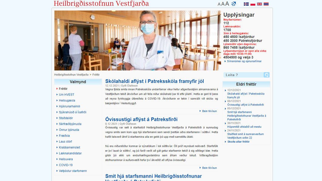
New homepage
Along with the new look, we launch a new website that replaces the older one that had become a child of its time. The new one should, for example, work well on mobile phones.
What is our name?
Foreign languages
- English: Westfjords Healthcare Institution (not West Fjords, not health care, not institute)
- Polish: Instytucja zdrowia na fjordach zachodnich.
- Swedish: Västfjordarnas sjukvårdsinstitut
- Norwegian: Health Vestfjord
- Danish: Vestfjordernes sundhedscenter
Abbreviations
The institute is called Westfjords Healthcare Institution. The abbreviation should be used as little as possible, and rather be spoken about the health institution or the institution in text if full name is too long or repetitive. Note the rules for capital and small letters, i.e. Westfjords Healthcare Institution capitalized but the health agency or the institution with a small
The inflection is like this:
- Nominative case, passive case and passive case: Vestfjörður Health Center
- Property loss: Vestfjörður Health Foundation
The abbreviation, where the name does not appear otherwise, is Why?. Avoid HORSE, and do not use at all H-vest, Hvest, HSV or other abbreviations.
Design Manual
The new look comes with a design guide that outlines fonts, color usage, use of photographs and more.
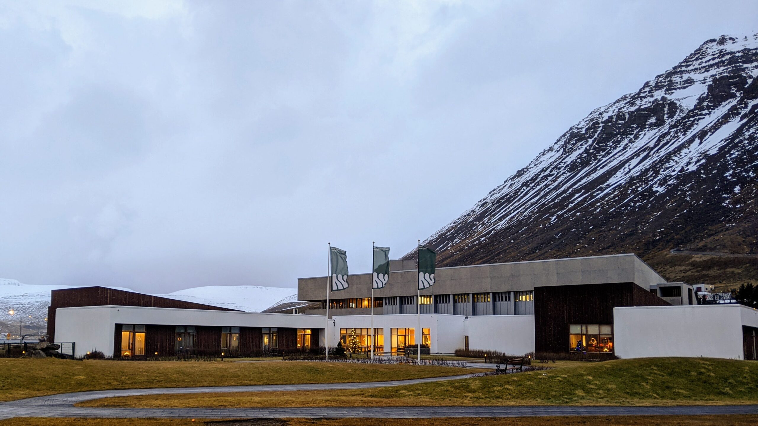
The changes were announced on December 14, but will take time
A new look was presented to the staff on December 14, 2021. Flags were raised and the organization's digital face gets a new look. The website was launched on December 16.
However, we show discretion in continuing to use what is useful, and prepare well for the changes that result from this. Outdoor signage needs to be designed, indoor signage needs to be completely reviewed, and all information on the website is correct and good.
Gylfi Ólafsson CEO